Studies have shown that it only takes customers 0.05 seconds to form an opinion on your food-related website. In those 0.05 seconds, they subconsciously determine whether they like your overall design or find it too cluttered. If it’s the latter there’s a much higher possibility that they decide to leave the site. That means websites are subjected to extreme judgment, especially when it comes to food brands. A good UX needs to be hyper-functional, personable, and engaging from the get-go. Don’t worry; to inspire you, we’ve found a few examples of the best CPG food brands to get your mind in the right direction.
Lenny & Larry’s
As you arrive at Lenny & Larry’s homepage you’re immersed in an on-brand experience. Visitors are immediately introduced to their reward program, sweepstakes, and new product line through an image carousel. Its goal is not only to spread awareness but to prompt customers to join. That way, customers don’t purchase a product and then exit the page. Instead, Lenny & Larry want customers to stay and engage with their website.
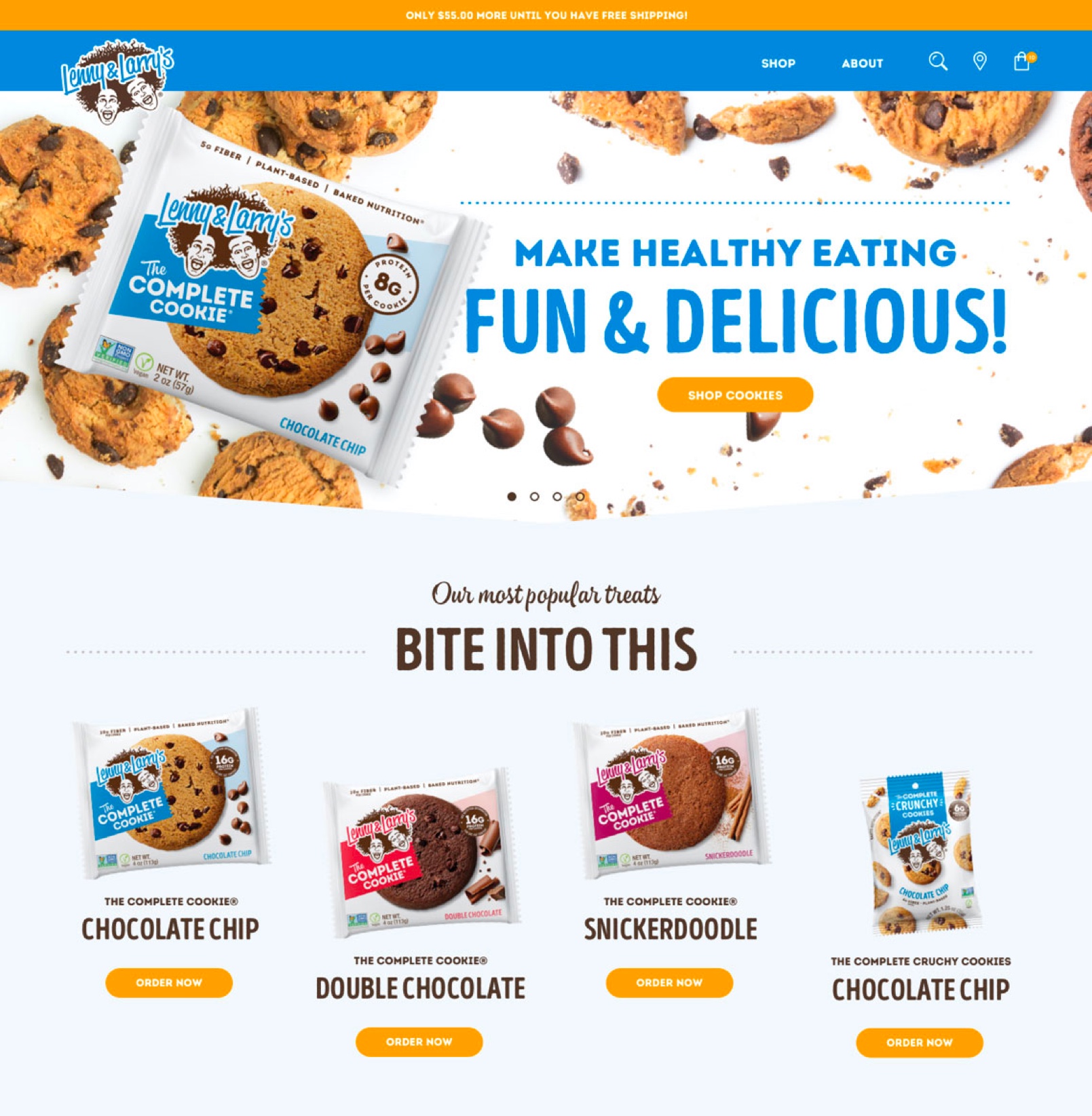
Whether it be to check their newsletter for new product releases or check their reward points, Lenny & Larry’s customers are active in their brand. Showcasing their rewards and sweepstakes upfront is a good way to increase customer retention and customer loyalty.
In fact, as you scroll down, the homepage lists some of the brand’s best-selling products along with a couple of customer reviews and business testimonials. In doing this, it earns the customer’s trust and displays that the brand has quality products. After all, customers are more likely to purchase from a company that has a good reputation from past customers and business critics.
Now, unlike some sites, Lenny & Larry show that they care about the community and the environment by giving back. They’ve partnered with National Parks to give back $150,000. In the past, they’ve also done Instagram giveaways and more to help rebuild the community.
The company appeals to those that are environmentally conscious and would like to purchase from companies that share similar beliefs. In fact, it even increases sales since it displays that company is charitable.
Ahem, by the way, we built this site.
Milk Bar
This bakery takes Shopify’s abilities to the next level. When the site pops on your screen, the first thing you see is a photo of different sweets. Looking at these scrumptious treats will immediately make any customer’s mouth water.
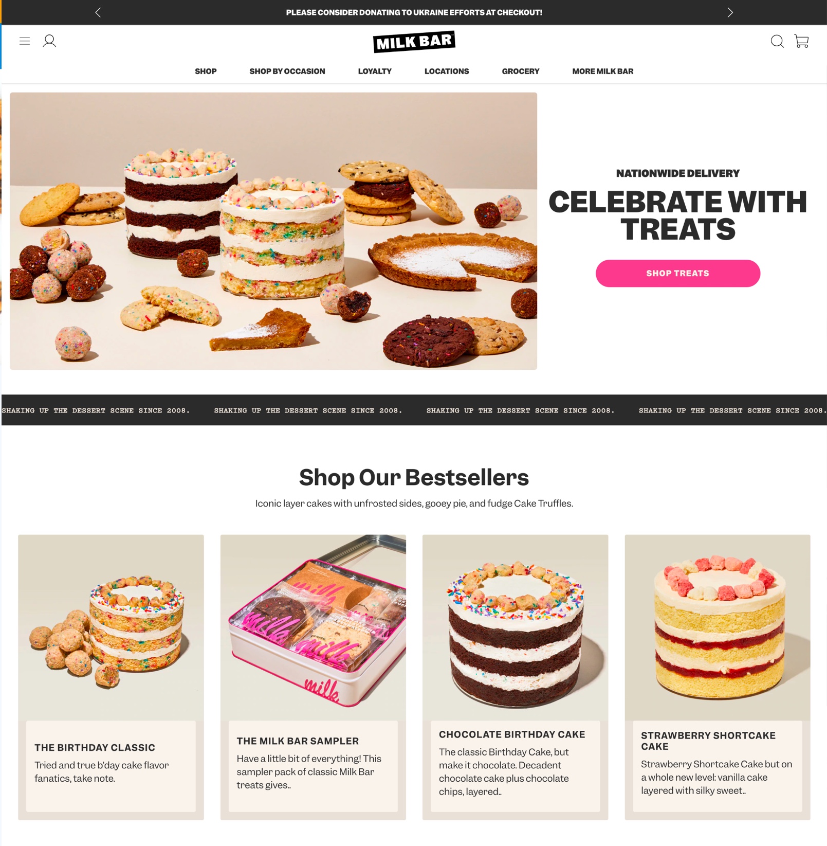
Desserts like cookies, cakes, and even cake bites are shown as well as a direct link to shop the products. By immediately showcasing their products, it helps the customer understand the brand and what they’re selling. there’s no doubt that it makes customers intrigued as to what flavors and other treats they offer, thereby making the customer indulge with the brand.
As you scroll down, there’s a carousel of their bestselling products as well as informative sections about the company, its mission, and its ingredients. These sections are crucial to any eCommerce website. They not only function as informational content but it helps persuade the customer to purchase the products due to their sustainable packaging, gluten-free ingredients, and more.
However, that’s not all; back at the top of the page, there are various menu options such as its products, grocery items, locations, and events. Milk Bar ensures that it not only advertises its products but what it can do for its customers.
For example, Milk Bar offers in-depth recipes and in-person baking classes and even has a baking club. Plus, it prides itself on putting the consumer first, so they have polls on what type of content customers would like to see in the club, what classes would be most helpful, and so on.
In offering these selections, the company has built more than a brand; it’s built a following. By establishing a baking community, the company can increase its customer base, thereby boosting awareness and accelerating sales.
Olive Oil Lovers
Olive Oil Lovers approaches its website a little differently from the rest. Instead of showcasing its products or its mission, they place their current sale on their homepage along with a link to shop its products. This is partially because they are the online destination for other brands in the olive oil space, vs. a brand peddling their own products.
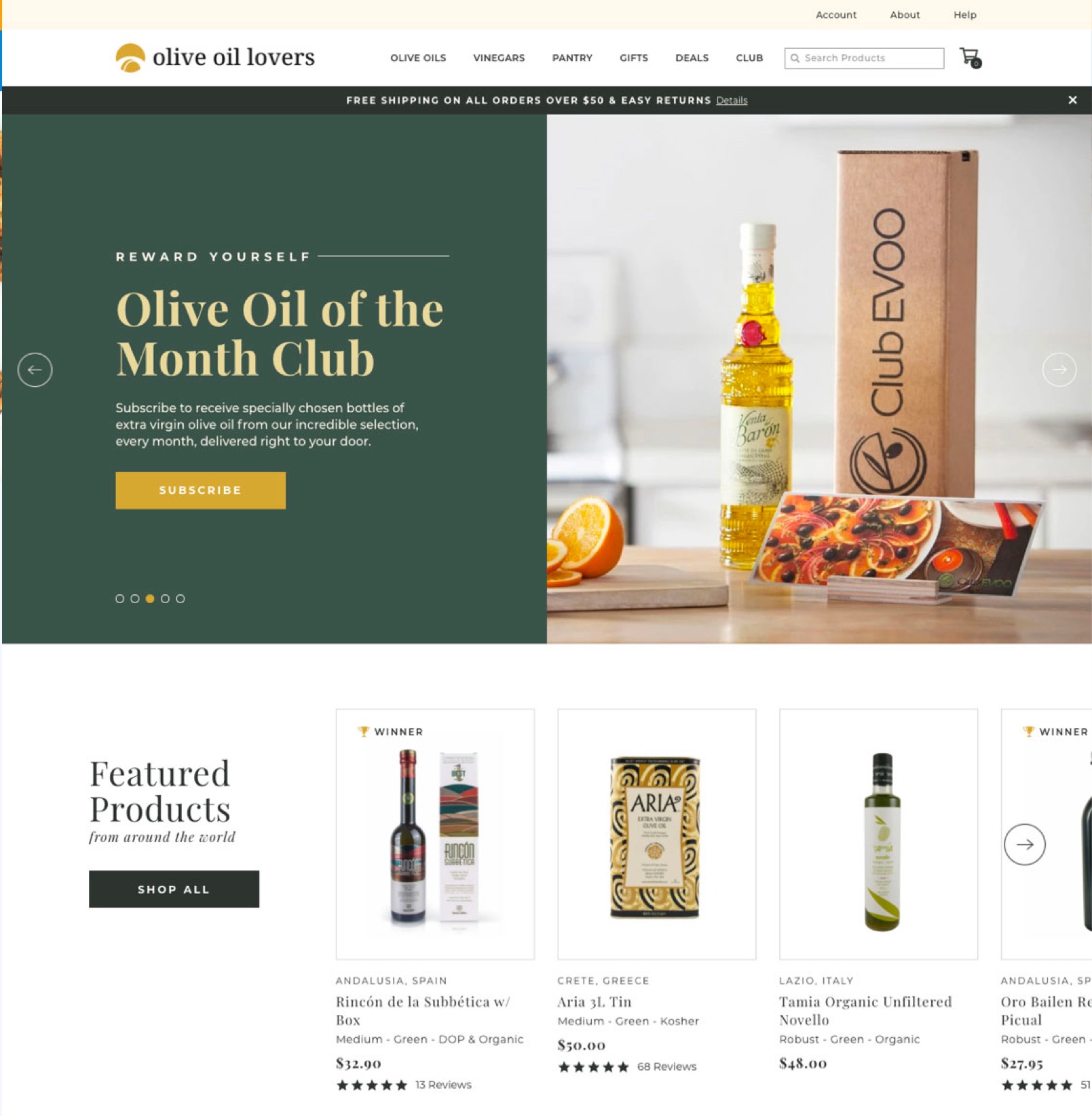
Their reasoning is twofold. First, it informs customers that their products are marked down. Secondly, it persuades customers to purchase those products due to a marketing strategy that incorporates scarcity.
However, that’s not all they do; as you click the shop button, you arrive at a curated product grid. The product grid not only helps customers find the product they need but also showcases which product is on sale, their overall reviews, and where it’s from. It gives the customer a quick snapshot that way; they don’t have to go through the whole catalog to find what they need.
Now, once you click on a product, you’ll find detailed information. For example, product pages include its ingredients, what it pairs with, its aroma, customer reviews, and faqs about the product.
That way, customers have the knowledge they need to make an educated purchase. After all, Olive Oil Lovers want customers to have a good experience with the company that way; they come back again and again to purchase more products.
By providing extra information, the customer can find the exact product they need, thereby eliminating the need to return products. It’s a clever tactic that helps increase profits and boost customer satisfaction.
At the top of the page, Olive Oil Lovers provides gifts and a subscription service. These services can be delivered straight to your home or gifted to a friend, co-worker, or loved one. In doing so, Olive Oil Lovers is spreading awareness, increasing their customer base, and even adapting to customers’ needs, which in turn boosts their reputation.
You know you’re itching for a site like this, whelp, we just so happened to have built it.
Huel
This company knows what they’re doing. When you first land on Huel’s website, you’re struck by the sleek and polished design. Unlike other websites, it utilizes only two colors: black and white, which happen to be the same colors as its logo.
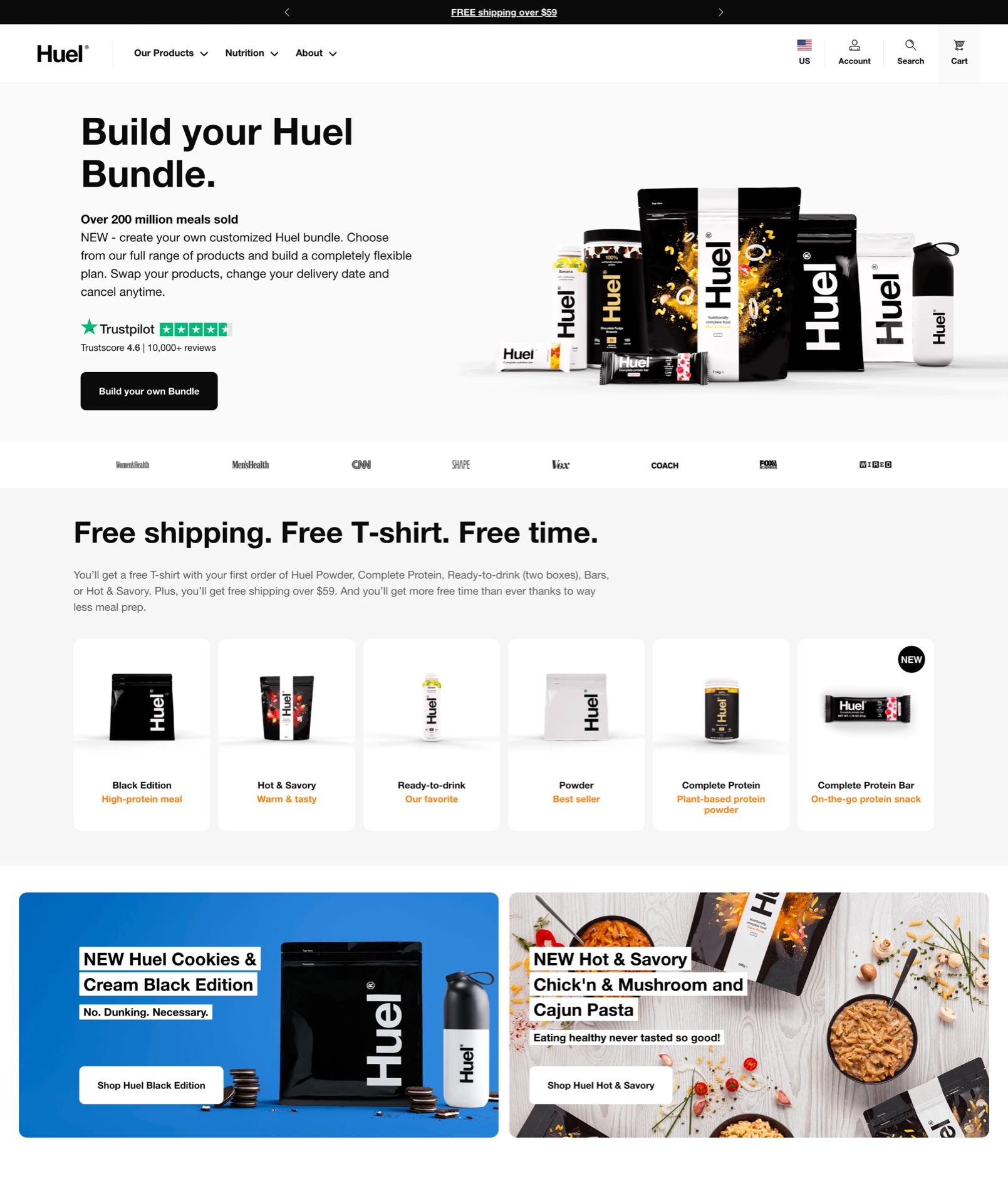
As you look at the main picture, you see a variety of products along with a short and sweet branding message. Instead of displaying the company’s name front and center or curated video clips, they get right to it with product advertising.
They showcase their bestselling products, as well as a link to purchase the items or a bundle set. They even include Trustpilot reviews and a list of companies in which they have been featured or mentioned.
By doing this, they boast their expertise, history, and favorable reputation. That way, customers that perhaps have never heard of the company can understand that they are looked upon as trustworthy and a quality retailer.
However, Huel offers more than just products. Huel provides cooking tips, recipes, guides to losing weight, building muscle, and much more. In fact, they even have a forum in which you can post everything and anything regarding Huel. The company supplies protein drinks and snacks but has created a community to help exercise beginners and fitness enthusiasts.
Sanders Candy
Right as you hit enter, you’re immersed into the candy land that is Sanders Candy. With images of the decadent treats, the company persuades you to purchase these sweets with short branding messages and sales.
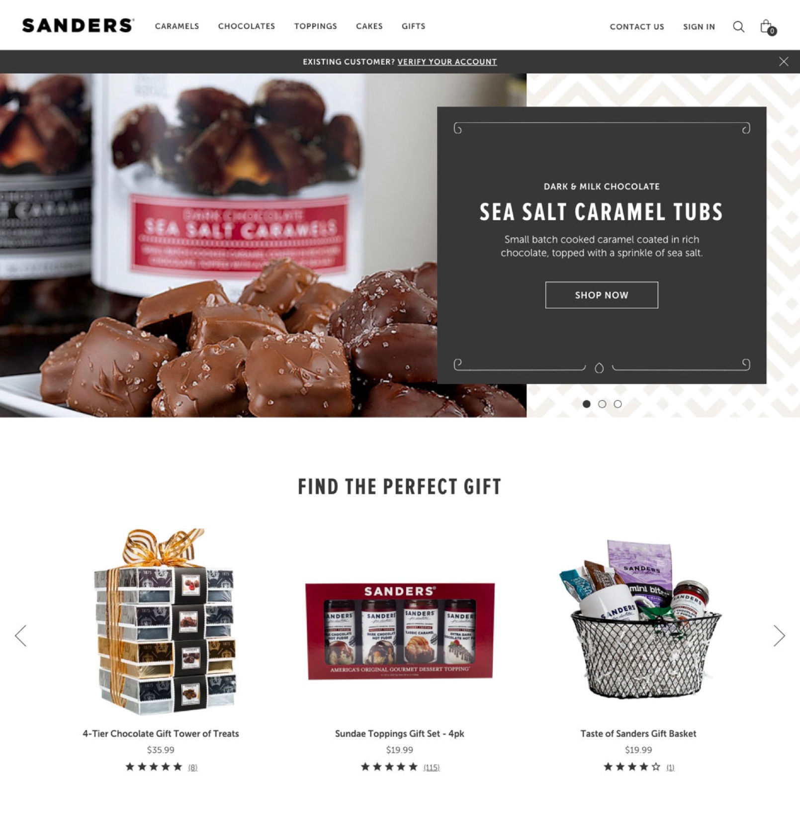
As you scroll down, there are tastefully crafted images that would make anyone crave a dessert. These images not only intrigue the customer but also make them engage with the brand.
For example, a customer will be more likely to click on the products to find the item in the photograph. Whether it be to purchase it, look at the ingredients, or simply find which store they can find it at. However, whatever they do, they are engaging in the website.
By including interesting photos on your website, you not only inform the customer of your products, but you prompt a purchase. This will, in turn, increase customer retention and boost sales.
Get Inspired
Building a website is difficult, especially when you need to keep your customers happy and informed. However, instead of simply following a tired template, take inspiration from the websites mentioned above. They throw out all expectations with their creative layouts, strategic product placement, and community network.
If you’re nervous about nailing a CPG UX, you really should enlist a Shopify Plus agency to do it properly the first time. Here at Sleepless Media, our surprisingly good looking team is committed to creating content that increases your customer base, boosts your sales, and competes with your national competition.
For more information about creating a Shopify eCommerce site, please don’t hesitate to reach out. We’d very much look forward to knocking it out of the park.


