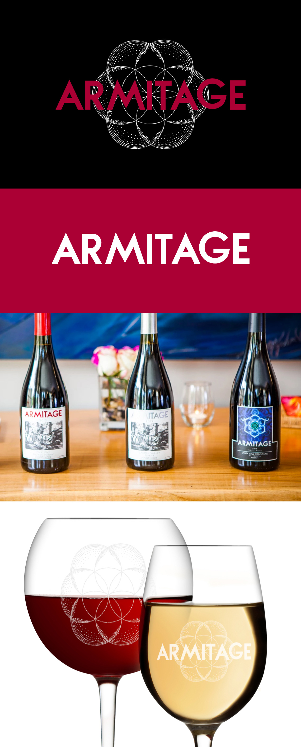
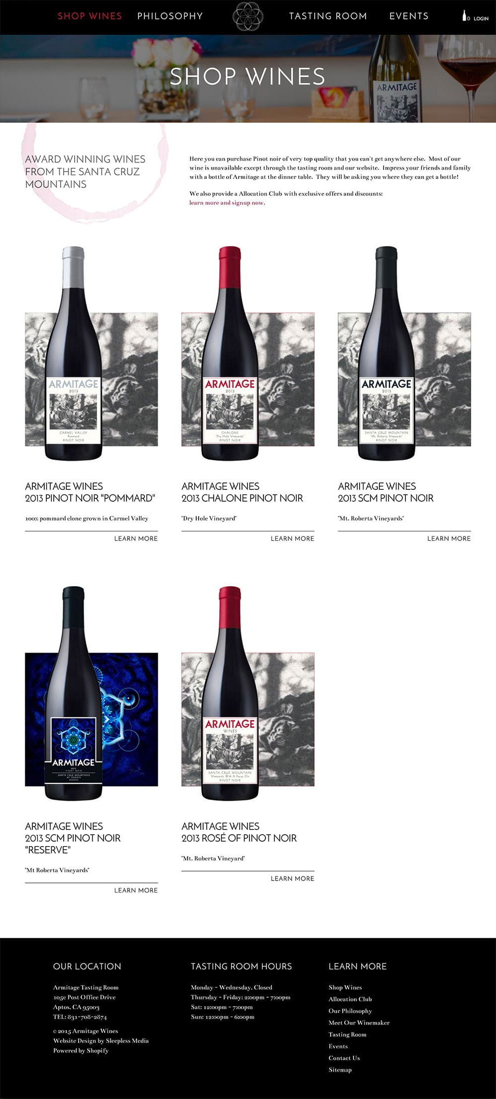
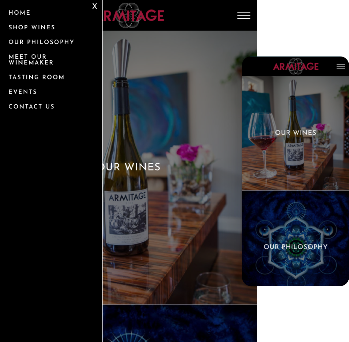
RebrandingArmitage has a winemaking philosophy that revolves around sacred geometry, with special significance on the Seed of Life. We took this well known geometric symbol and created a logo that was unique, flexible, and in harmony with their existing visual presence. It's versatile and flexible in that the symbol can be used alone, as is the case where it's stamped on top of their corks. While the typeface can be used alone, or in combination with the mark for an iconic emblem. Armitage knew they wanted to incorporate the sacred geometry used throughout their winemaking process as part of their visual identity. The design evolved from wine glass rings to a more refined and elegant geometric design that Armitage fell in love with.


 Headquartered in Santa Cruz, CA