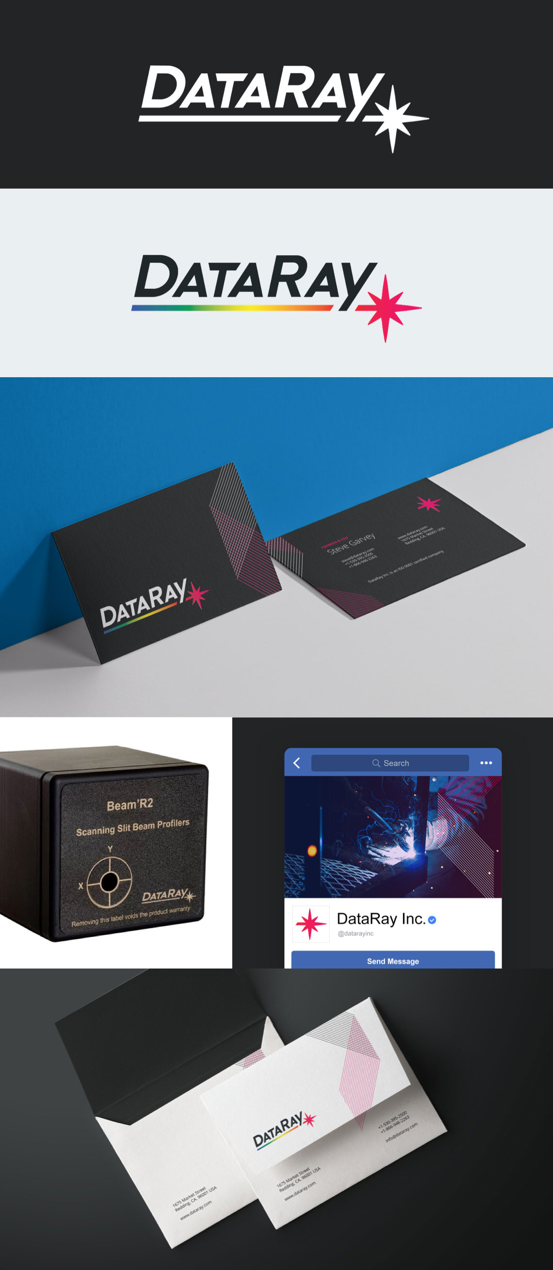
BrandingLike many companies, DataRay has grown organically since their inception in 1988, but their branding was never something they focused on. A longtime client, we were about to embark on our third website redesign with them, and collectively decided it’d be a good time to do a brand refresh as well. We tossed out their previous logo’s off-the-shelf typeface in favor of custom lettering that invokes motion and strength. Keeping it simplistic, the word mark is underscored by a laser beam that’s punctuated with a star-like point of light. The new logo shines in both black and white, and its spectrum colored glory.


